For the next few posts, I am going to talk a little bit about some of my more recent design work, then I have no doubt I will get back into crochet.
I realized my personal design and logo has changed a bit since my last post on it way back in 2007.
I like to think that it is a good representation of where I was to where I am now, especially skill wise.
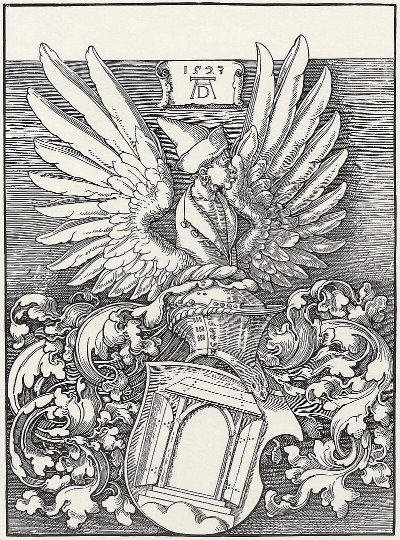
I've been using what I call my "fish mark" since college when I needed a quick and easy way to sign my work in ceramics and printmaking. I'd been studying Albrecht Duerer, particularly his wood cut prints, and liked his signature a lot. It's that AD thing at the top under the date.
For a very short time I tried to replicate Duerers, but with my initials. It was too much of a rip off though, so I worked on it and realized that turning it on its side I could make it look like a fish! That's where I got the first one in the old post. That first one was a scanned drawing that I tried to clean up in photoshop.
Since then I've done a lot of work in the field of graphic design. The current logo is constructed in Illustrator. The AS of the fish was made from a font I liked, can't remember which anymore, that I heavily modified to get the shapes of the letters where I wanted them. When the logo is large like this, it is also easy to see that the lines around making up the pentagon shape are actually tools that represent my skills. Specifically these are: a pencil, brush, tablet stylus, crochet hook, and a black marker for my site name.
These tools are also represented in the argyle background on this site, with an emphasis on the little black marker, for my sites namesake, but that's next week's post.
It is really nice to have a good logo to represent myself. And like all logos, it might change again in the future, but for now it's a great way to see my past. Been thinking about getting a decal for my car... could be cool.

